
Visual Identity Creation: Top 5 Secrets to Success
Why Visual Identity Creation Is Your Brand’s First Impression
Visual identity creation is the strategic process of developing the visual elements that represent your brand, from logos and colors to typography and imagery.
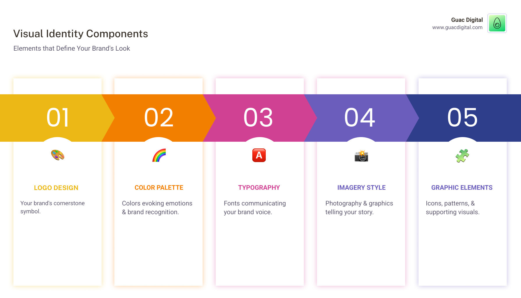
Key Components of Visual Identity Creation:
- Logo design – Your brand’s cornerstone symbol
- Color palette – Primary and secondary colors that evoke emotions
- Typography – Fonts that communicate your brand voice
- Imagery style – Photography and graphics that tell your story
- Graphic elements – Icons, patterns, and supporting visuals
The Process:
- Strategy & Research – Define brand core and analyze audience
- Creative Development – Create mood boards and concepts
- Asset Creation – Design logos, select colors, and build guidelines
- Implementation – Apply consistently across all touchpoints
In today’s crowded digital marketplace, you have just 0.1 seconds to make a first impression. That’s how long potential customers need to form a lasting opinion about your brand.
Your visual identity isn’t just about aesthetics; it’s about building trust, driving recognition, and creating emotional connections. A unique brand color can improve recognition by 80%, and consistent visual branding can increase revenue by up to 23%.
The challenge for mid-sized businesses is creating a cohesive visual system that cuts through the noise and speaks to their target market. This goes far beyond just designing a logo.
I’m Guy Leon, founder and CEO of Guac Digital. We’ve helped businesses boost client engagement by 350% through strategic campaigns that include visual identity creation. I’ve seen how the right visual system can transform a business’s online presence and customer perception.
The Foundation: Understanding Visual Identity vs. Brand Identity
Think of your brand as a person. Their brand identity is their personality, values, and beliefs—who they are at their core. Their visual identity is what you see immediately—their style and how they present themselves.
This distinction is crucial because looks and substance must work together. Brand identity is your mission, values, target audience, and story. It’s the emotional connection you want to create in your customers’ minds.
Visual identity transforms those intangible feelings into things people see and remember: your logo, colors, typography, and imagery. While marketers shape the brand identity, designers bring it to life visually.
A strong visual identity is a powerful tool for Boosting Brand Awareness. It connects your brand’s personality with the outside world, making abstract concepts memorable.
| Feature | Visual Identity (The Look) | Brand Identity (The Being) |
|---|---|---|
| Focus | Visual features and aesthetics | Holistic expression: visual + non-visual elements |
| Elements | Logo, colors, typography, imagery, graphic elements | Mission, values, voice, tone, personality, brand story, visual identity |
| Purpose | Recognition, differentiation, aesthetic appeal | Building trust, loyalty, emotional connection, market positioning |
| Perception | How the brand looks | How the brand feels and behaves |
| Primary Creator | Designers, creative directors | Marketers, strategists, leadership |
Why a Strong Visual Identity is Crucial for Success
In today’s noisy marketplace, a strong visual identity is essential for survival and growth. Here’s why:
Brand recognition happens lightning fast. Consistent use of a unique brand color can improve brand recognition by 80%. You instantly recognize Coca-Cola’s red or Starbucks’ green. This recognition keeps your brand top-of-mind when customers are ready to buy.
Trust builds in the blink of an eye. People form first impressions in just 0.1 seconds. A polished visual identity signals reliability. With 88% of consumers valuing authenticity, visual consistency is a trust-building superpower.
Emotional connections drive loyalty and sales. When people feel an emotional connection to a brand, 76% will choose it over competitors, and 57% will spend more. Your visual identity speaks to emotions, helping build loyalty beyond simple transactions.
Standing out becomes possible. In a crowded market, your visual identity gives you a unique face that people remember. It’s your secret weapon for attracting the right customers.
Marketing becomes more efficient. A well-defined visual identity system with clear guidelines helps your marketing team work faster. Centralizing visual assets can save companies over 1,000 hours annually.
Your team feels proud. A consistent, professional representation of your company builds pride and unity among employees, turning them into brand ambassadors.
The visual content market is growing rapidly, and 51.4% of marketers incorporate visuals into nearly all content. The message is clear: visual identity creation isn’t optional. It’s the foundation for everything else.
The Anatomy of a Powerful Visual Identity
Building a compelling visual identity is like constructing a house; each element plays a crucial role in creating a cohesive system that communicates your brand’s essence. Let’s break down the core components.
Logo
Your logo is the cornerstone of your brand’s visual identity. It’s the primary symbol customers will associate with your business. A good logo is:
- Simple: Easy to recognize and remember. Simplicity also ensures memorability and scalability.
- Memorable: Unique and distinctive enough to stick in people’s minds.
- Versatile and Scalable: It should look great and be legible across all mediums, from a tiny app icon to a large billboard.
- Meaningful: The best logos subtly tie into the brand’s narrative.
A logo is a mark, not a paragraph; it shouldn’t try to do too much heavy lifting. For more insights, check out these Expert tips on great logo design.
Color Palette
Colors are powerful tools that evoke emotion and influence perception. Color psychology links specific colors to feelings: blue for trust, green for growth, and red for energy.
Your brand’s color palette typically consists of:
- Primary Colors: The dominant colors that define your brand’s core look.
- Secondary Colors: Supporting colors that complement the primary palette.
- Accent Colors: Used sparingly to highlight key information or calls to action.
Consistent color usage is paramount for brand recognition, which can be boosted by 80%. When choosing your palette, consider your brand’s personality, audience, and cultural associations. Understanding How color impacts consumer behavior is crucial, as color can influence up to 90% of purchasing decisions. We recommend sticking to no more than three primary colors for a cohesive scheme.
Typography
Typography is the art of arranging type. Your font choices communicate your brand’s voice and personality as much as your logo or colors do. A message can feel scary or romantic based purely on its font.
When selecting fonts, consider:
- Readability: Is it easy to read across different sizes and platforms?
- Brand Voice: Does it align with your brand’s personality? Sans-serif fonts often feel modern, while serif fonts convey tradition.
- Hierarchy: Using different weights and sizes helps guide the reader’s eye. You typically need at least two typefaces: one for headlines and one for body text.
The right typography ensures your messages are understood and felt. For digital products, clear typography is key to user experience, which is a core part of our UI/UX Design Services.
Imagery and Photography
Your imagery style—whether it’s photography, illustrations, or iconography—is a powerful tool to communicate your brand story and establish a unique aesthetic. Images often speak more persuasively than words.
Key considerations for imagery:
- Authenticity: Generic stock images can undermine credibility. Real, relatable imagery builds trust and fosters genuine connections.
- Curated Style: Develop a consistent visual style for all your images, including lighting, composition, and subject matter.
- Stock vs. Custom: While stock photography can be cost-effective, custom photography ensures your images are unique to your brand.

Generic images that don’t reflect your true values can harm credibility. Custom visuals, created to meet your brand’s unique needs, always yield more interesting results.
Graphic Elements
Beyond logos, colors, and fonts, a strong visual identity often incorporates additional graphic elements that add personality and reinforce your brand’s visual language. These can include:
- Icons: Simple, communicative symbols used across websites and apps.
- Illustrations: Custom drawings that convey a unique brand personality.
- Patterns and Textures: Repeating designs that add visual interest.
- Data Visualization: Consistent styles for charts and graphs.
These elements, when used cohesively, contribute to a rich and memorable visual experience.
The Blueprint: A Step-by-Step Guide to Visual Identity Creation
Creating a powerful visual identity isn’t something you can rush. It’s a strategic process that requires careful planning, creative exploration, and thoughtful execution. Like building a house, you need a solid foundation before you can start decorating.
After working with hundreds of businesses on their visual identity creation journeys, I’ve learned that successful projects follow a clear, methodical approach. Here’s the blueprint we use at Guac Digital to transform brand concepts into memorable visual systems:

Step 1: Laying the Groundwork (Strategy & Research)
Before touching a design tool, we need to understand who you are and where you’re going. This step is crucial; skipping it results in something that looks pretty but doesn’t work for your business.
Defining your brand core means digging into your mission, values, and vision. We ask what problem you solve, what promises you make, and what makes you different. Your visual identity must reflect this essence, not just follow trends.
Next is target audience analysis. We create detailed profiles of your ideal customers, including how they think, what they value, and what visual styles resonate with them. A tech startup’s visuals will differ greatly from a law firm’s.
In the competitive analysis phase, we study your competitors’ visuals—their colors, typography, and imagery. The goal isn’t to copy but to find opportunities to stand out. If competitors use blue, perhaps warmer colors and authentic photography can differentiate your brand.
We also create buyer personas, detailing the people who will interact with your brand. Understanding their preferences and expectations guides every future design decision.
Step 2: The Creative Process of visual identity creation
Now, strategy meets creativity. This is where your brand starts to come alive visually in an exploratory phase.
Mood boards are our starting point for visual brainstorming. We collect images, colors, and typography to capture the desired feeling and establish the overall aesthetic direction.
During concept development, our designers sketch and explore different visual directions, creating logo concepts and experimenting with colors and typography. This turns abstract concepts into concrete visuals.
The feedback and iteration process is crucial. We present multiple concepts and work with you to refine them, ensuring the final design reflects your brand’s personality and goals. You can see examples of this process in Our Portfolio.
Gathering stakeholder feedback during this phase prevents costly revisions. We encourage honest dialogue, always keeping strategic goals in mind.
Step 3: Building the Core Assets of your visual identity creation
With a clear creative direction, we create your brand assets. This is where concepts become the visual elements you’ll use daily.
The logo design process involves creating a family of variations: a full logo for letterheads, a simplified version for social media, and an icon for apps. Each must work in its context while maintaining brand integrity.
Selecting typefaces is complex. We consider readability, brand personality, and hierarchy. A playful startup might use friendly fonts, while a financial firm needs something more traditional.
Defining color codes means establishing exact specifications (CMYK for print, RGB for digital, HEX for web). This precision ensures consistency everywhere, from business cards to billboards.
Curating imagery style means creating guidelines for all visuals. Should photos be bright or moody? Do you use illustrations? These decisions create a cohesive visual language.
For businesses who want to handle some design work internally after the core identity is established, tools like Adobe Express and Stencil can help maintain consistency. However, the strategic foundation and core asset creation really benefit from professional expertise to ensure everything works together as a cohesive system.
Bringing It All Together: Consistency and Longevity
The magic of visual identity creation doesn’t end when you’ve designed your last logo variation. That’s where the real work begins. The difference between a visual identity that gathers dust and one that drives business results lies in how consistently you apply it and how thoughtfully you nurture it over time.
Think of your visual identity like a garden. You can plant the most beautiful flowers, but without consistent care, even the most stunning garden will lose its impact. The same principle applies to your brand’s visual presence.
Creating and Using a Brand Style Guide
Your brand style guide is your visual identity’s instruction manual. This comprehensive guide ensures that everyone knows exactly how to represent your brand visually.
A well-crafted brand style guide covers logo usage rules with clear specifications for minimum sizes, clear space, approved color variations, and examples of what not to do.
Color specifications are another crucial section, providing precise CMYK, RGB, and HEX codes. This detail ensures your brand red looks the same on a business card, your website, or a billboard.
Typography rules define which fonts to use where, establishing clear hierarchies. Imagery guidelines help maintain a consistent visual tone, and voice and tone guidelines ensure your written communication matches your visual personality.
Companies like TikTok have mastered this approach – their comprehensive Brand Book helps maintain their playful, dynamic brand personality across countless markets.
Maintaining Consistency Across All Touchpoints
Many businesses stumble by applying a beautiful visual identity inconsistently. Your customers expect the same cohesive look whether they’re visiting your website, opening your email, or walking into your store.
Your digital presence is often a customer’s first impression. Your website design, social media profiles, and email templates must all speak with the same visual voice. You can explore examples of seamless visual integration in our Web Design Portfolio.
Print collateral like business cards and brochures still play a vital role in building credibility. Packaging is crucial for product-based businesses, as it’s often the first physical interaction with your brand.
Don’t forget about physical spaces. Your office, retail locations, and employee uniforms all contribute to the overall brand experience. Every touchpoint is an opportunity to reinforce your brand message.
Evolving Your Visual Identity Over Time
While consistency is crucial, your visual identity shouldn’t be a museum piece. Smart brands understand that evolution is necessary for staying relevant, but they approach changes strategically.
The key is understanding the difference between a brand refresh and a complete rebrand. Sometimes, updating your color palette or modernizing your typography is enough. Other times, significant business changes require more dramatic updates.
Avoiding fleeting trends is essential for long-term success. Basing your core visual identity on trends can quickly make your brand look dated. The recent “blanding” phenomenon, where brands adopt nearly identical minimalist aesthetics, shows what happens when everyone chases the same trends—they become indistinguishable.
Instead, focus on market relevance and authentic brand expression. Companies like IBM have demonstrated how to maintain visual consistency while staying innovative through their enduring Design Language, proving that systematic approaches can provide both stability and flexibility.
The goal is to build a foundation strong enough to support your brand’s growth while flexible enough to adapt to new challenges.
Frequently Asked Questions about Visual Identity
When we work with clients on visual identity creation, we hear the same questions time and time again. Let me share the answers to the most common ones.
What is the most important element of a visual identity?
Asking about the “most important” element is like asking which ingredient makes a cake taste good. The magic happens when everything works together.
The real power of visual identity creation lies in cohesion and synergy. Your logo might be the face of your brand, but without the right colors, typography, and imagery supporting it, it’s just a pretty picture. A successful visual identity is a holistic system where every element reinforces the others. No single element can carry the weight alone; consistent application across all touchpoints builds recognition and trust.
How do I ensure my visual identity is accessible?
Making your visual identity accessible isn’t just good practice—it’s essential for reaching everyone. Accessible design often leads to better design overall.
Start with color contrast. Your text needs to stand out clearly against its background. The Web Content Accessibility Guidelines (WCAG) provide specific contrast ratios to follow, and free online tools can test your combinations.
Next, focus on legible fonts. Choose clear, well-designed typefaces for your main content, saving decorative fonts for headlines where they won’t interfere with comprehension.
Don’t forget about alt text for images on your website. Screen readers rely on these descriptions to convey visual information to users who can’t see them. Finally, ensure your logo and other design elements remain clear when scaled up or down.
How much does it cost to create a visual identity?
This is like asking “how much does a car cost?” The answer depends on what you need.
DIY tools can get you started for under $100, but you’ll likely end up with something generic. Freelancers typically charge from a few hundred to several thousand dollars, depending on their experience and the scope of work.
Working with an agency like Guac Digital represents a bigger investment, usually thousands to tens of thousands of dollars. But you’re paying for strategic research, competitive analysis, multiple design iterations, and comprehensive brand guidelines.
Think of professional visual identity creation as an investment in brand equity. The ROI comes through increased brand recognition, customer trust, and market differentiation. The question isn’t about cost—it’s about value. What’s it worth to have customers instantly recognize your brand and choose you over competitors?
Conclusion
Your visual identity creation journey is far more than picking out colors that look nice together or sketching a clever logo. It’s about building a strategic asset that becomes the face of your business – one that communicates who you are before you even say a word.
Think about it: every successful brand you can name has a visual identity so strong that you’d recognize it from across a crowded room. That’s not an accident. It’s the result of thoughtful planning, creative expertise, and most importantly, consistent application across every single touchpoint where customers meet your brand.
The process we’ve walked through together – from laying that crucial strategic groundwork to crafting each visual element with purpose – isn’t just about making things look professional. It’s about creating a system that builds trust, drives recognition, and ultimately fuels your business growth.
Here’s what I’ve learned after years of helping businesses transform their brand presence: consistency truly is key to standing out in our crowded digital marketplace. When your visual identity works harmoniously across your website, social media, packaging, and every other place your brand appears, something powerful happens. Your audience starts to recognize you instantly. They begin to trust you more. And trust, as we all know, is what turns browsers into buyers.
At Guac Digital, we’ve seen how the right visual identity system can completely transform a business’s trajectory. We don’t just create pretty designs – we build comprehensive visual systems that speak directly to your target market and lay the foundation for long-term success.
Your brand deserves more than a generic logo pulled from a template library. It deserves a visual identity that captures its unique personality and connects with the people who matter most to your business.
Ready to move beyond just having a logo to creating a complete visual identity system that truly works for your business? Explore our expert Branding Services and let’s build something that speaks volumes about who you are and where you’re going.