
conversion rate optimization website design: 10 Powerful Tips for Success 2025
The Science Behind Converting Visitors to Customers
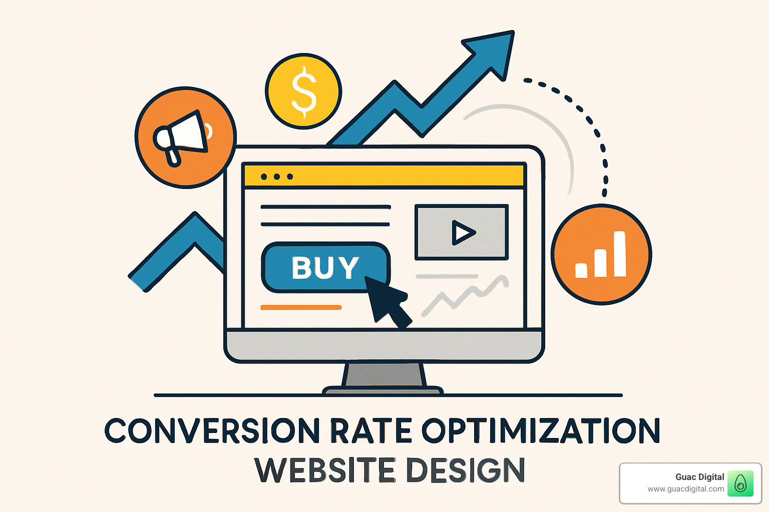
Conversion rate optimization website design focuses on creating websites specifically engineered to turn visitors into customers. Understanding this concept is crucial for any business looking to improve their online results.
Quick Answer: What is Conversion Rate Optimization Website Design?
Conversion rate optimization website design is the practice of designing web pages using:
- Strategic layouts – Using F-patterns and rule-of-thirds for optimal element placement
- Clear CTAs – Making buttons stand out with contrasting colors and action-oriented text
- Trust elements – Incorporating testimonials, reviews, and security badges
- Simplified user journeys – Removing friction points in forms and checkout processes
- Speed optimization – Ensuring pages load in under 2 seconds to prevent abandonment
- Mobile responsiveness – Designing for the 57% of traffic coming from mobile devices
Did you know you have approximately 8 seconds to capture a visitor’s attention once they land on your website? In today’s digital landscape, having a beautiful website isn’t enough—it needs to convert. With average eCommerce conversion rates hovering around 2.86%, there’s significant room for improvement for most businesses.
The difference between a website that simply exists and one that actively generates leads and sales comes down to intentional design choices backed by data and user behavior insights. Conversion rate optimization website design isn’t about random changes; it’s a systematic approach to improving user experience in ways that motivate action.
75% of consumers judge a brand’s credibility based on website design alone, making it one of your most powerful marketing tools. Yet many businesses focus solely on driving more traffic rather than optimizing the traffic they already have.
I’m Guy Leon, founder of Guac Digital, where I’ve helped businesses increase their conversion rates by up to 350% through implementing strategic conversion rate optimization website design principles that transform casual browsers into loyal customers.
Conversion rate optimization website design terms to learn:
– conversion optimization for ecommerce website
– conversion rate optimization tools
– how to optimize website for conversions
What Is CRO in Web Design & Why It Matters
Conversion rate optimization website design transforms your website from a digital brochure into a customer-generating machine. At its core, CRO is about enhancing your website’s user experience to boost the percentage of visitors who take meaningful actions—whether that’s making a purchase, filling out a contact form, or signing up for your newsletter.
In today’s crowded digital marketplace, standing out matters more than ever. Our research shows that over 70% of CMOs have noticed increased competition for customers within their markets. This isn’t just a trend—it’s the new reality of doing business online.
“For every $92 spent on getting new customers, companies only put $1 into improving conversion rates.”
This eye-opening statistic reveals a massive opportunity that most businesses are missing. While your competitors pour money into acquiring new traffic, you could be quietly optimizing what you already have—turning more of your existing visitors into paying customers.
Here at Guac Digital, we’ve consistently found that focusing on conversion rate optimization website design delivers exceptional ROI compared to endlessly chasing new traffic. It’s the difference between fishing with a bigger net versus actually learning where the fish are biting.
Great CRO is like being an attentive host at a party—you’re anticipating your guests’ needs, removing obstacles from their path, and gently guiding them toward the experiences you want them to have. This requires understanding your customer’s journey at a deep level and using a blend of psychology, design principles, and data analysis to create not just a beautiful website, but one strategically designed to convert.
More info about How to Optimize Website for Conversions
CRO vs. SEO vs. UX
These three digital marketing pillars often get mixed up, but they each serve distinct (yet complementary) purposes in your online strategy:
SEO is your invitation to the party—it’s about getting people to your website by improving visibility in search engines. When we optimize for search intent, we’re making sure the right people find you at the right time.
UX is your party atmosphere—it focuses on making your website intuitive, accessible, and enjoyable. Good UX ensures visitors have a positive experience once they arrive, with fast loading times, intuitive navigation, and content that speaks directly to their needs.
CRO is your persuasive conversation—it’s the art of turning those visitors into customers through strategic design and content choices. While your visitors are enjoying themselves (thanks to good UX), CRO is quietly working to guide them toward taking action.
The real magic happens when all three work in harmony. For example, as a Tampa-based agency, we might help you rank for “Tampa digital marketing services” (SEO), ensure your site loads lightning-fast on any device (UX), while making your consultation booking process so smooth and compelling that visitors can’t help but take that next step (CRO).
Macro vs. Micro Conversions
Understanding the difference between big wins and small victories is crucial for effective conversion rate optimization website design.
Macro conversions are your ultimate business goals—the primary actions that directly impact your bottom line. These include completing a purchase, submitting a lead form, requesting a consultation, or starting a free trial. They’re the finish line in your customer journey.
Micro conversions, on the other hand, are the stepping stones along the way. These smaller actions signal engagement and progress: adding items to a cart, creating an account, subscribing to a newsletter, watching a product video, downloading a resource, or sharing content on social media.
One CRO expert we interviewed put it perfectly: “Micro-conversions are critical building blocks that feed into larger macro-conversion goals.” They’re like breadcrumbs leading through the forest—each small step brings visitors closer to becoming customers.
We’ve seen this play out countless times at Guac Digital. For instance, when we optimized a client’s newsletter signup process (a micro-conversion), their actual sales (the macro-conversion) increased by 23% over the following quarter. Why? Because these engaged subscribers had already taken a small step toward trusting the brand, making them significantly more likely to eventually make a purchase.
By tracking both types of conversions, you gain a comprehensive view of your entire funnel, allowing you to pinpoint exactly where potential customers are getting stuck—and fix those issues before they cost you more business.
Measuring Success: Formulas, Benchmarks & Conversion Types
Let’s talk about how to actually measure your success with conversion rate optimization website design. After all, if you can’t measure it, you can’t improve it—and we’re all about making real improvements here.
The conversion rate formula is beautifully simple:
Conversion Rate = (Number of Conversions / Number of Visitors) × 100
So if your website welcomed 10,000 visitors last month and 300 of them pulled out their credit cards and made a purchase, your conversion rate sits at a neat 3%. Not too shabby!
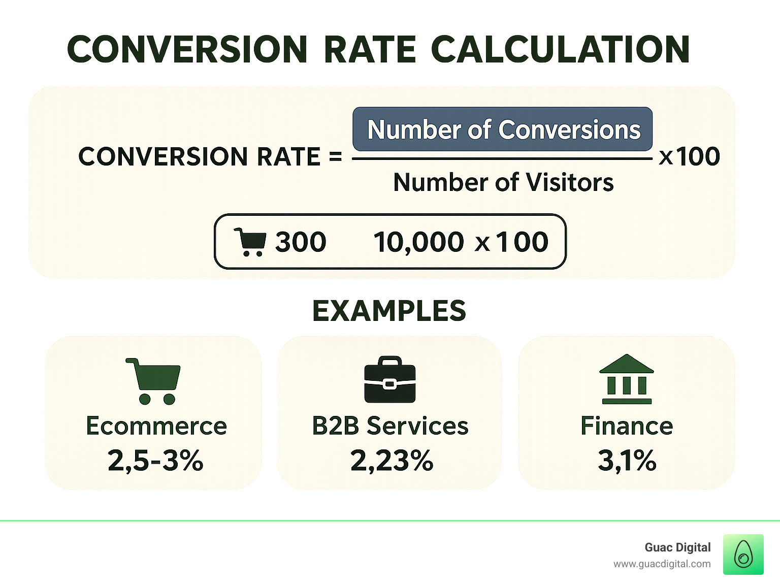
Now, what’s a “good” conversion rate? Well, if you’re hitting above 3%, pop the champagne—you’re playing in the big leagues. But remember, these numbers vary widely across industries. Our research shows average benchmarks like:
- Ecommerce shops typically hover around 2.5-3%
- B2B services convert at about 2.23%
- Financial services sites reach about 3.1%
- Healthcare websites achieve around 3%
- Travel sites typically see 2.4%
- Professional services (like us at Guac Digital!) average a healthy 4.6%
These numbers give you context, but your real competition is yourself. The goal is continuous improvement of your own metrics over time, not just matching industry averages.
How to Calculate Your Conversion Rate
Getting accurate conversion data isn’t rocket science, but it does require some setup:
First, get crystal clear on what counts as a conversion for your business. Is it a purchase? A form submission? A phone call?
Next, make sure your tracking tools are properly configured. Google Analytics 4 (GA4) is your best friend here—it’ll track both who’s visiting and what they’re doing once they arrive.
Be consistent with your measurement timeframes. Whether you’re looking at weekly, monthly, or quarterly data, stick with it so you can spot meaningful trends.
Finally, don’t just look at overall numbers. Dig deeper by segmenting your conversion rates by traffic source, device type, and user demographics. At Guac Digital, we’ve uncovered game-changing insights by noticing that mobile users from social media converted 40% better on simplified landing pages.
Setting up conversion tracking in GA4 is straightforward:
– Steer to “Configure” > “Events” > “Mark as conversion”
– Create custom events for specific actions you care about
– Build exploration reports to analyze the paths people take before converting
Remember what one CRO expert told us during our research: “A purely numerical approach to CRO overlooks individual motivations; a holistic, people-first strategy uncovers drivers, barriers, and hooks that truly impact conversions.” Numbers matter, but understanding the humans behind those numbers matters more.
Key Pages to Track
Not all pages deserve equal attention when it comes to conversion rate optimization website design. Focus your energy on these conversion powerhouses:
Your homepage makes that crucial first impression. It should instantly communicate your value proposition and guide visitors toward their next step—whether that’s exploring products or contacting your team.
Product and service pages are where the magic happens. This is where detailed information lives and where purchase decisions crystallize. At Guac Digital, we’ve seen that optimizing product pages alone can boost overall site conversion rates by up to 35%.
If you’re in ecommerce, your checkout process deserves microscopic attention. Each step represents a potential exit point, and streamlining this journey can dramatically improve your bottom line.
Don’t overlook your blog posts. These content marketing workhorses are perfect for capturing leads who aren’t quite ready to buy but are interested in your expertise.
Finally, landing pages designed specifically for campaigns deserve special attention since they’re built with conversion in mind from the ground up.
By focusing your optimization efforts on these high-impact pages first, you’ll get the biggest return on your time and resource investment—something we always prioritize for our clients at Guac Digital.
Principles of Conversion-Focused Web Design
Now that we understand what conversion rate optimization website design is and how to measure it, let’s dive into the core principles that make websites convert visitors into customers.
Hick’s Law and Choice Paralysis
Have you ever stood frozen in the cereal aisle, overwhelmed by choices? That’s exactly what happens to your website visitors when faced with too many options. Hick’s Law tells us that decision time increases with the number of choices available.
Smart businesses like Intercom have acceptd this by streamlining their navigation to just three options. The results speak for themselves – in one of our case studies, simplifying a homepage from six different CTAs to just one primary button increased conversions by a whopping 33%.
Think of each page on your site as having one job to do. As we often tell our clients at Guac Digital, “Every page should aim to achieve one specific objective.” Break complex processes into manageable steps and reveal advanced features only when needed. Your visitors will thank you by converting more often.
Visual Hierarchy and the Rule of Thirds
Ever wonder why some websites just feel “right” while others seem cluttered and confusing? It’s all about visual hierarchy – the art of guiding visitors’ eyes exactly where you want them to go.
The rule of thirds, borrowed from photography, works beautifully in conversion rate optimization website design. Imagine your screen divided into a 3×3 grid, with four intersection points. These “power points” are prime real estate for your most important elements, especially your primary CTA. Companies like HubSpot don’t place their signup buttons randomly – they strategically position them at these intersection points.
Western users typically scan pages in an F-shaped pattern – heavy attention across the top, less to the second horizontal line, and then scanning vertically down the left side. Designing with this natural behavior in mind ensures your most important elements get noticed first.
Speed, Mobile & Accessibility
In today’s impatient world, speed isn’t just nice to have – it’s essential. Our research shows that a mere 1-second delay in page load time can slash conversions by 7%. That’s potential revenue walking out the digital door!
To keep your site speedy, compress those images, minify your CSS and JavaScript, implement browser caching, use a CDN, and prioritize loading content above the fold first. These technical tweaks make a real difference in how quickly your site delivers value to visitors.
With mobile traffic now accounting for over 57% of web visits, your site absolutely must shine on smaller screens. This means responsive design, thumb-friendly navigation (no tiny buttons!), simplified forms, and text that’s readable without squinting or zooming. Test your site on multiple devices – what looks perfect on your desktop might be a frustrating mess on someone’s phone.
Want to dig deeper into site speed? Check out this detailed guide on Site speed.
Information & Visual Hierarchy
Good conversion rate optimization website design isn’t just about looking pretty – it’s about organizing information so visitors can easily find what they need and understand what matters most.
Think like a journalist using the inverted pyramid approach – lead with your most important information. Break text into scannable chunks with clear subheadings, bullet points where appropriate, and short paragraphs that don’t overwhelm. Group related elements together to create visual relationships that make sense intuitively.
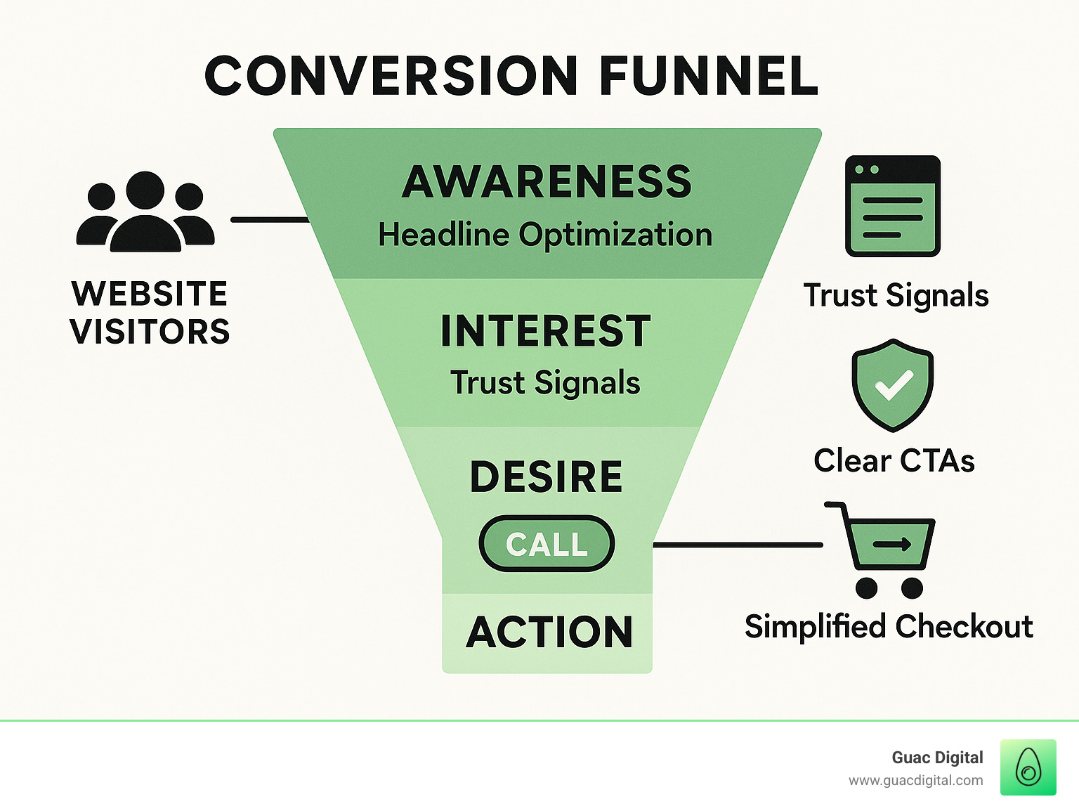
The AIDA framework (Attention, Interest, Desire, Action) provides a proven structure for guiding visitors through your content. We’ve seen this approach work wonders – one of our ecommerce clients restructured their homepage to tell a coherent story leading naturally to the CTA, resulting in a 35.6% increase in online sales.
Calls-to-Action That Convert
Your CTA is where the magic happens – the moment of truth in conversion rate optimization website design. Getting it right can make the difference between a bounce and a conversion.
Effective CTAs need to stand out with contrasting colors (though they should still complement your brand palette). Use action-oriented text that inspires movement – “Get Started” beats “Submit” any day of the week. Focus on the value visitors will receive, not just the action they need to take. “Start Saving Today” connects with people’s goals, while “Sign Up” just sounds like work.
Place your CTAs strategically – above the fold, after you’ve built a compelling case, and at natural decision points throughout the page. Give them breathing room with adequate whitespace, and consider adding small microcopy that addresses common objections or adds urgency (“No credit card required” or “Limited time offer”).
One myth we love to bust: CTAs don’t have to be orange! In our testing at Guac Digital, we found that changing a button from “Learn More” to “See How It Works” increased clicks by 38% – proving that specific, action-oriented language often matters more than color.
Trust, Risk Reversal & Social Proof
With 75% of consumers judging your credibility based on website design, building trust isn’t optional – it’s essential for conversion.
Sprinkle trust elements throughout your site: authentic customer testimonials (with photos when possible), star ratings and verified purchase reviews, security badges showing your site is safe, money-back guarantees that reduce perceived risk, clear privacy assurances, and relevant industry certifications.
These elements work because they address the underlying question in every visitor’s mind: “Can I trust this company?” One of our ecommerce clients saw a 33.2% increase in revenue per visitor simply by enlarging review stars on product pages – a small change with significant impact.
Reducing Friction in Forms & Checkout
Forms and checkout processes are often the final hurdle before conversion – and unfortunately, a common place where potential customers abandon ship.
The average checkout form displays nearly 12 fields, though only 8 are typically necessary. Every field you add is another opportunity for visitors to reconsider and leave. Ask only for essential information. Offer single-page checkout when possible to reduce perceived complexity. Always provide a guest checkout option – forcing account creation is a conversion killer.
Make forms smarter with browser autofill support, real-time validation that catches errors immediately, and clear progress indicators for multi-step processes. Consider hiding non-essential fields behind a toggle to keep the initial form looking simple and approachable.
We saw this approach work beautifully for a fashion client who boosted add-to-cart clicks by 5.6% by streamlining their checkout from 5 steps to just 3. Sometimes, less really is more when it comes to conversion rate optimization website design.
Want to learn more about creating websites that truly convert? Check out our guide to Conversion Optimized Website.
Conversion Rate Optimization Website Design Checklist
Ready to transform your website into a conversion powerhouse? At Guac Digital, we’ve refined our approach to conversion rate optimization website design into a practical checklist that gets results. Think of this as your roadmap to better conversions—no guesswork required.
Here’s our battle-tested 10-point audit checklist that we use with clients to identify conversion opportunities:
Value Proposition – Is your unique selling point immediately clear to visitors within the first 5 seconds? Your above-the-fold content should answer “why you?” before visitors need to scroll.
Page Speed – The 2-second rule is real. We’ve seen conversion rates drop by 7% for every second beyond that threshold. Your beautiful design means nothing if visitors bounce before seeing it.
Mobile Responsiveness – With phones generating 57% of web traffic, your site needs to look and function flawlessly across all devices. This isn’t just about scaling—it’s about reimagining the experience for thumbs, not mouse pointers.
Visual Hierarchy – When we eye-track visitors, they follow predictable patterns. Does your design guide their eyes naturally to conversion elements, or are you making them hunt for what matters?
CTA Clarity – Your calls-to-action should practically jump off the page. We’re not just talking about color (though contrast matters)—but about compelling, benefit-focused language that makes clicking irresistible.
Trust Elements – Nothing kills conversions faster than doubt. Have you strategically placed testimonials, reviews, security badges, and guarantees to reassure visitors at their moment of hesitation?
Form Simplicity – Every field you add to a form reduces completion rates. We’ve seen conversion increases of up to 120% just by cutting unnecessary form fields. Ask yourself: “Do I really need this information right now?”
Content Clarity – Is your copy scannable with clear headlines, short paragraphs, and highlighted key points? People don’t read websites—they scan them in an F-pattern.
Navigation – Intuitive navigation isn’t about being clever—it’s about meeting expectations. Can users find what they need in three clicks or less?
Error Handling – When something goes wrong, does your site offer helpful guidance or just frustrate users? Clear error messages with recovery paths can save abandoned conversions.
When our clients ask where to start with this list, we recommend using what we call the PIE framework to prioritize your efforts:
Potential – Which changes will likely deliver the biggest conversion lift?
Importance – Which pages receive the most valuable traffic that could be converted?
Ease – What can be implemented quickly without major development resources?
This approach helps you focus on the low-hanging fruit first—high-impact changes that can be implemented relatively easily. Why rebuild your entire checkout process when simply clarifying your shipping information might resolve 80% of abandonment issues?
Conversion Rate Optimization Website Design for Product Pages
Product pages are the moment of truth for ecommerce sites. This is where browsers transform into buyers—or where you lose them forever.
We’ve found several elements consistently drive product page conversions:
High-quality images make all the difference. Customers can’t touch your products—your visuals need to do the heavy lifting. Multiple angles, zoom functionality, and 360° views can reduce uncertainty and return rates. One client saw a 22% conversion increase simply by improving product photography.
Detailed descriptions should answer questions before they arise. Focus on benefits, not just features. Don’t just say “stainless steel construction”—say “stainless steel construction means this will never rust, even in humid Florida bathrooms.”
Customer reviews provide social proof that your product delivers. Place these prominently—we’ve found that moving reviews higher on the page increased conversion rates by 17% for an apparel client.
Comparison tools help customers make confident decisions. When we implemented side-by-side comparison functionality for a tech client, their average order value increased by 24% as customers better understood premium feature benefits.
Scarcity indicators tap into powerful psychological triggers. Showing limited stock or time-sensitive offers (“Only 3 left!” or “Sale ends in 24 hours”) creates urgency that motivates immediate action.
One of our ecommerce clients experienced a remarkable 76% revenue increase after we redesigned their product filtering system. The change made it dramatically easier for customers to narrow down options and find exactly what they needed.
Conversion Optimization for Ecommerce Website
Conversion Rate Optimization Website Design for Landing Pages
Landing pages have one job: convert visitors from a specific source. Unlike your main website with multiple paths and options, landing pages should be laser-focused on a single conversion goal.
The most effective landing pages include these conversion-driving elements:
Compelling above-fold content is non-negotiable. Your headline, subheadline, and primary CTA must be visible without scrolling and communicate your value proposition instantly. You have about 3 seconds to convince visitors they’re in the right place.
Message match creates coherence between your ads and landing page. When someone clicks on an ad promising “50% off organic dog food,” your landing page better lead with that exact offer—not a generic welcome message.
Minimal navigation keeps visitors focused. We typically remove main navigation menus from landing pages to eliminate distractions. One client saw a 28% conversion improvement after we removed navigation options that were leading visitors away from the form.
Benefit-focused content speaks directly to customer needs. Instead of talking about what your product does, emphasize how it makes your customers’ lives better. Transform “Our CRM has 50+ features” into “Save 5 hours every week with automated follow-ups.”
Exit-intent popups give you a second chance at conversion. When properly implemented (not annoying!), these can recover up to 15% of otherwise lost visitors by offering a compelling reason to stay or leave their email.
We recently redesigned a landing page for a financial services client, swapping their generic headline for one highlighting a specific “32% average savings” benefit. The result? A stunning 79% increase in qualified leads. Small changes, big results.
Conversion Rate Optimization Website Design for Mobile Users
If you’re not optimizing for mobile, you’re potentially losing more than half your conversions. With 57% of web traffic coming from mobile devices, smartphone-friendly design isn’t optional—it’s essential.
Mobile conversion rate optimization website design requires specific considerations:
Thumb-friendly navigation acknowledges how people actually hold their phones. Key interactive elements should be in the “thumb zone”—the area easily reached without stretching or adjusting grip. We’ve seen interaction rates increase by 15% just by repositioning key buttons.
Compressed images balance quality with speed. Mobile users are often on slower connections, making page speed even more critical. We use next-gen formats like WebP to maintain visual impact while reducing load times.
Simplified forms recognize the challenge of typing on small screens. Every field you can eliminate improves completion rates. For one client, simply removing the “confirm email” field increased mobile form completions by 34%.
Larger touch targets prevent frustration. Buttons and interactive elements should be at least 44×44 pixels—about the size of an adult fingertip. When we increased button sizes for a travel client, their mobile booking rate improved by 22%.
Readable text without zooming is essential (minimum 16px). Nothing drives mobile users away faster than squinting to read tiny text.
A retail client came to us struggling with mobile conversions. By redesigning their mobile menu to expose subcategories upfront and simplifying the navigation flow, we improved their listing-page visits by 4% and—more importantly—increased transactions by 29%.
Mobile optimization isn’t about shrinking your desktop site—it’s about reimagining the experience for on-the-go users with different needs and behaviors.
Data, Tools & Experimentation
Conversion rate optimization website design isn’t about guesswork or gut feelings—it’s a methodical, data-driven approach that transforms how websites perform. At Guac Digital, we’ve seen how the right tools can uncover insights that completely change conversion trajectories.
Analytics & Behavior Insights
The magic of CRO happens when you peek behind the curtain to see how users actually interact with your site. Think of it as being a detective—the clues are there if you know where to look.
Google Analytics gives you the foundation, showing you the “what” of user behavior—which pages they visit, how long they stay, and where they drop off. But to truly understand your visitors, you need to go deeper.
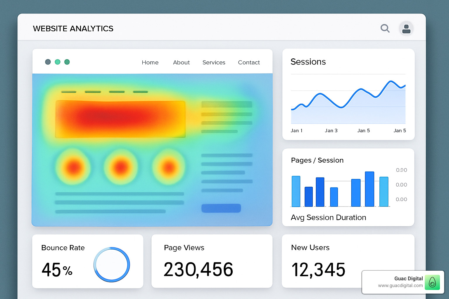
Heatmaps have been game-changers for our clients. There’s something incredibly revealing about seeing those red “hot spots” showing exactly where users click most frequently—or the blue “cold” areas they ignore completely. I remember one client who was shocked to find users were repeatedly clicking on a decorative element they thought was a button!
Session recordings take this a step further, letting you watch real users steer your site. It’s like sitting beside them as they scroll, hesitate, get confused, or breeze through your content. This qualitative insight is pure gold for understanding the “why” behind your analytics data.
Funnel analysis helps you visualize the customer journey, highlighting those critical moments where visitors abandon ship. For one ecommerce client, we finded a 43% drop-off at a specific step in the checkout process—fixing that single issue boosted their overall conversion rate by 15%.
User surveys complement all this data by simply asking visitors about their experience. Sometimes the most valuable insights come from a straightforward question like “What stopped you from completing your purchase today?”
Running Effective A/B Tests
A/B testing is where science meets marketing. It’s the process of creating two versions of a page and letting real users tell you which one works better.
The key to successful testing lies in forming strong hypotheses based on your data. Rather than saying “Let’s try a green button,” a good hypothesis might be: “Based on our heatmap data showing low engagement with our current CTA, changing the button color to green will increase visibility and improve click-through rates by at least 5%.”
Sample size matters tremendously. I’ve seen businesses get excited about a 30% improvement after just 100 visitors, only to watch that “improvement” disappear as more data came in. For most tests, you’ll need thousands of visitors to reach statistical significance—the point where you can be confident your results aren’t just random chance.
“Your and my opinions about what works on a site are ‘rubbish’ without data-backed testing.”
One of my favorite testing success stories involved a client who was absolutely certain their lengthy, detailed product descriptions were necessary. Our A/B test revealed that shorter, benefit-focused descriptions increased conversions by 27%. The data spoke louder than any opinion could.
Testing isn’t a one-and-done activity. The most successful businesses build a culture of continuous testing and optimization, where each insight leads to the next hypothesis in an ongoing cycle of improvement.
Tech Stack Essentials
Building your CRO toolkit doesn’t have to be overwhelming. Start with these essential tools that give you the biggest bang for your buck:
For understanding how users behave, tools like Hotjar and Microsoft Clarity offer heatmaps and session recordings that reveal pain points you might never have noticed otherwise. CrazyEgg is another excellent option with its scroll maps feature.
A/B testing platforms like Optimizely, VWO, or even Google Optimize (though it’s being sunset) let you test variations without coding knowledge. These tools handle the traffic splitting and statistical analysis so you can focus on creating better experiences.
Page speed dramatically impacts conversions, with a 1-second delay potentially reducing conversions by 7%. Tools like PageSpeed Insights help identify what’s slowing your site down.
For our clients who need to optimize landing pages quickly, Unbounce has been invaluable for creating and testing high-converting pages without developer resources.
At Guac Digital, we’ve found the most powerful insights often come from combining multiple tools—perhaps seeing a drop-off point in Google Analytics, then using Hotjar to watch exactly how users are interacting with that page, and finally testing a solution with Optimizely.
Scientific research on user reading F-pattern confirms what we’ve seen in our heatmaps—users typically scan content in an F-shaped pattern, which should inform your content placement strategy.
Need help identifying where your website could improve? Our comprehensive Site Audit examines your current performance and highlights opportunities for conversion optimization.
Frequently Asked Questions about CRO Web Design
How often should I run A/B tests?
Think of A/B testing like tending a garden – it’s not a one-and-done activity but an ongoing process of growth and refinement.
At Guac Digital, we’ve found that consistent testing yields the best results. Most of our successful clients maintain a regular testing calendar, typically running 2-4 tests each month across different pages. The magic happens when you make this a habit rather than a sporadic effort.
Your traffic volume will dictate how frequently you can run meaningful tests. You need enough visitors to reach statistical significance – usually within 1-2 weeks for optimal momentum. If your site gets fewer visitors, don’t worry! Just focus your testing efforts on your highest-traffic pages first and let tests run a bit longer.
The goal isn’t to test everything at once but to build a culture of continuous improvement where testing becomes as routine as checking your analytics.
What is a good ecommerce conversion rate today?
When clients ask me this question, I always smile because the answer isn’t as straightforward as they hope. While the average ecommerce conversion rate hovers around 2.86%, what’s “good” varies tremendously depending on your specific situation.
Consider these contextual differences:
– General retail typically sees 2-3%
– Luxury products often convert at just 0.5-1.5% (those higher price points naturally mean more consideration)
– Subscription services enjoy higher rates of 3-5%
– B2B products generally fall in the 1.5-2.5% range
Rather than obsessing over industry benchmarks, I encourage focusing on your own growth trajectory. If you’re currently at 1.5%, let’s aim for 2%, then 2.5%, and keep climbing from there.
The most fulfilling part of my work at Guac Digital has been watching clients double their conversion rates through methodical optimization – regardless of where they started. Your own improvement curve is much more meaningful than any industry average.
Does color alone really boost conversions?
The “magic button color” might be one of the most persistent myths in conversion rate optimization website design. While there are famous case studies showing dramatic improvements from color changes (like that oft-cited 21% boost from switching green to red), the reality is more nuanced.
Color is just one instrument in a much larger orchestra of conversion factors. What truly matters is:
Contrast – Your call-to-action needs to stand out from its surroundings. Sometimes an orange button converts better simply because it pops against a blue background, not because orange has magical properties.
Brand alignment – Colors that feel disconnected from your overall brand can create subtle trust issues. That perfect-converting red button might actually hurt you if it clashes with your brand’s carefully crafted blue identity.
Emotional context – Colors carry psychological weight. Soft blues might work beautifully for a meditation app but fall flat for a limited-time sale.
Accessibility – A color choice that doesn’t provide sufficient contrast for all users effectively excludes potential customers.
Instead of asking “what color converts best?” try asking “what color will stand out most in this specific context while maintaining my brand identity?” That’s the question that leads to meaningful improvements.
At Guac Digital, we’ve learned that thoughtful color choices matter – but always as part of a holistic approach to conversion design, never in isolation.
Conclusion
Conversion rate optimization website design isn’t a checkbox you can tick off your to-do list. It’s more like tending a garden—an ongoing process that requires attention, care, and regular adjustments based on what’s actually happening with your visitors.
Think of your website as a living, breathing asset that can continuously improve over time. When you apply the principles we’ve explored throughout this guide, you’re essentially changing that static digital brochure into a hardworking sales machine that connects with visitors and guides them toward meaningful actions.
As you move forward with your optimization journey, keep these essential points in mind:
First, start with solid measurement. Without proper tracking and analytics, you’re essentially flying blind. The data you collect becomes your roadmap for improvements.
Next, focus on understanding user journeys from start to finish. By mapping out how visitors steer your site and identifying where they get stuck or drop off, you’ll find the friction points that need smoothing out.
Be strategic about where you focus your energy by prioritizing high-impact changes. The PIE framework (Potential, Importance, Ease) helps you tackle the improvements that will make the biggest difference with reasonable effort.
Always remember to test methodically rather than making changes based on hunches or personal preferences. Let real user data guide your decisions—what actually works often surprises even the most experienced designers.
Finally, accept the mindset that optimization is never truly complete. There’s always another test to run, another insight to uncover, another improvement to make. This continuous improvement approach keeps your site fresh and effective even as user expectations evolve.
At Guac Digital, we love helping businesses in Tampa and beyond transform their websites into conversion engines. Our approach blends strategic design principles with data-driven testing to deliver real, measurable results. We’ve seen how combining big data insights with thoughtful, programmatic marketing strategies can dramatically improve conversion rates.
The businesses that pull ahead of their competition today are those that view their websites as evolving platforms—not static showcases. By adopting this growth-oriented mindset, you’ll extract maximum value from every visitor who lands on your site.
More info about our digital services
Ready to see what your website could really achieve? Reach out for a comprehensive site audit and a personalized CRO strategy built specifically for your business goals. We’d love to help you turn more of those visitors into loyal customers.